
Instagram changed its logo. The bit you actually tap is the same
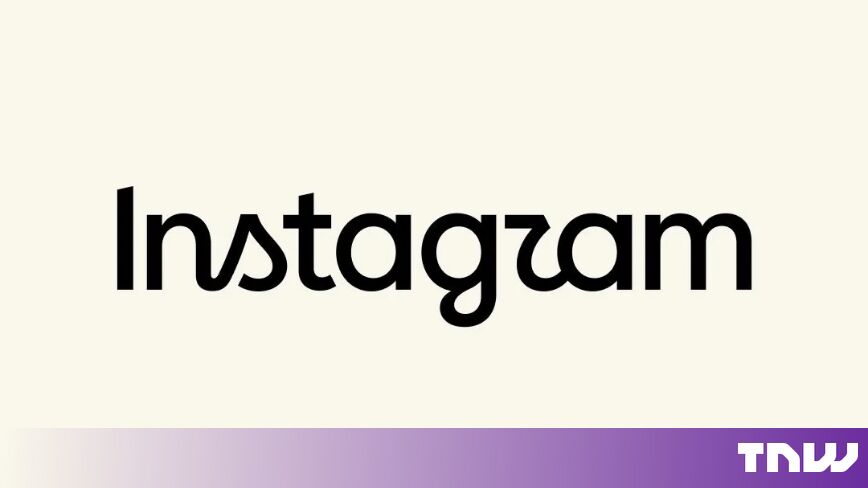
Instagram changed its wordmark on Thursday. A wordmark is the written name, the word “Instagram” as it appears at the top of the app.
It is not the icon. The pink and orange gradient square on your home screen is untouched.
The change itself is small. The new type carries cursive curves on the letters s, r and g, where the old wordmark ran cleaner.
What Adam Mosseri said it was for
Adam Mosseri called the result “sharper and more modern”, TechCrunch reported. The head of Instagram said it still referenced the original and kept things simple.
That is a careful sentence. It claims novelty and continuity at once, which is what every brand refresh claims.
The reaction split along predictable lines. Some users liked the fresher type. Others said the new r looks like a boat sail, or that the whole thing now reads as “Instagzam”.
Neither camp is...
Copyright of this story solely belongs to thenextweb.com. To see the full text click HERE