
How Mobbin Helped Me Redesign Slovo Without Copying Another App
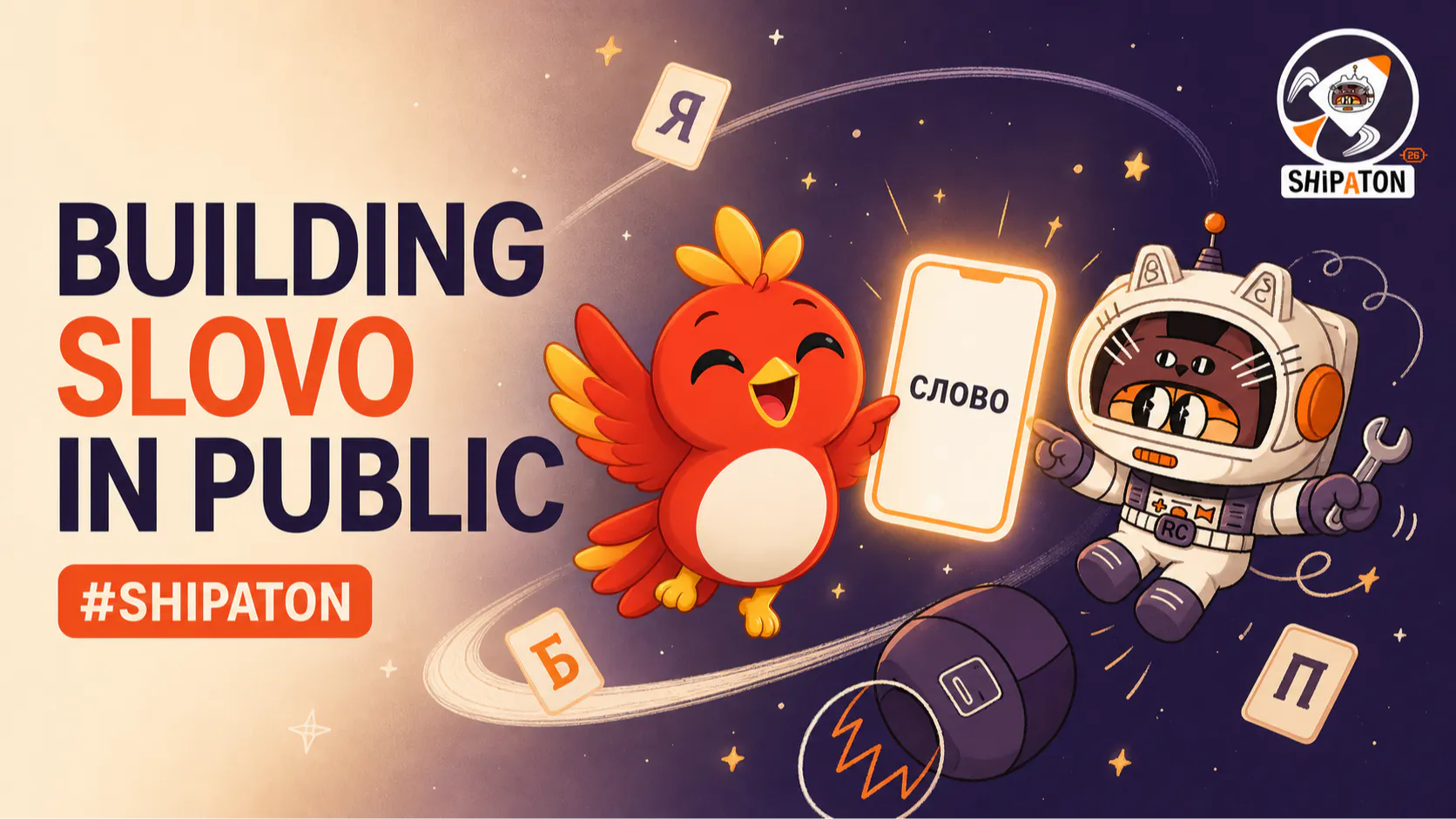
The first Slovo paywall was technically complete.
It loaded subscription packages, let the user select a plan, and could begin a purchase. It was also visually cold, overly spacious, and disconnected from the rest of the app.
The feedback was direct: “Why is this design so ugly?”
That was more useful than polite approval.
Slovo is a Russian learning app with a warm paper background, dark editorial typography, a red brand accent, rounded cards, and an expressive bird mascot. The original paywall looked like a generic commerce sheet placed on top of that experience.
I used Mobbin to study how polished mobile apps structure onboarding and subscription decisions. The goal was not to find a screen to reproduce. It was to understand which recurring patterns solved real comprehension problems.
The Questions I Took From the Research
I compared flows by asking:
- Is value explained before price?
- Can users compare plans...
Copyright of this story solely belongs to hackernoon.com. To see the full text click HERE